
What is a responsive website?
Put simply, a responsive website is one that adapts to the screen size and orientation that the visitor is using. So if you are viewing a website on a phone, you won’t see the same thing as if you were using a desktop computer.
Why is it so important?
As the rise of the smartphone continues, the majority of visitors to your site are likely to be using a phone or a tablet. You want to give them them the best possible experience when they arrive at your site regardless of the device they are using. If a site is difficult to use they are likely to give up, and unlikely to return. Common issues are:
- text is too small to read (zooming in is required)
- need to scroll in all directions
- clickable elements are too close together (which may result on tapping on the wrong link)
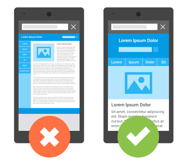
This image (borrowed from Google) sums things up nicely
Another important consideration is that Google uses mobile-friendliness as a factor in determining its search results. So, if your site is not mobile-friendly, it will rank lower in the search results, and you will miss out on potential traffic.
Is your website mobile-friendly?
Use this handy mobile-friendly test tool from Google to check if your site is mobile-friendly.
If your site is not mobile friendly, it will list the issues and give advice on how to fix them.
I can help
If you need any help or advice, please get in touch.
References
Why mobile? – advice from Google.
Continuing to make the web more mobile friendly – Google Webmaster Central Blog (16 March 2016)